Candytopia AR App Design: Explore Candytopia in a fun way
AR Mobile App UX/UI Design
Client: Hummingbirdsday
About Candytopia:
Candytopia is the materialization of Candyland and Willy Wonka’s chocolate factory in one, unique experience. Users are tasked with exploring the physical and virtual realm with futuristic technologies such as augmented reality and virtual reality to capture the imagination of tech-savvy and Instagram affiliated generations.
Project Goals:
Candytopia requested a creative augmented reality (AR) app that allowed young people to take eye-catching and imaginative photos natively within the app. Our strategy emphasized intuitive user experience and a modern and simplistic, yet functional and inspiring interface.
Process:
Using Candytopia’s social media presence such as Facebook, Instagram, and Twitter, we were able to gather reviews and customer feedback to inform our preliminary and final designs. Most customers and users used Candytopia as fodder for their social media accounts. The location acted as a photographic playhouse that urged users to interact with the environment and experiment with their art. We intended to capture that free spirit and liberal atmosphere in our design by allowing users to discover the AR functions of the app rapidly and use these functions in all environments. We wanted to inspire even more interaction between users and the museum exhibitions by creating AR avatars and graphics that directly related to the exhibitions we found in our research.
Strategy:
With museums and experiences like this, the main focus of the app should be to allow the users to be present and use the app with ease. The app should be integrated with the experiences seamlessly and not distract the user from all the work put into Candytopia. In order to achieve this combination of simplicity and functionality, we oriented the buttons for relevant functions of the app in easy-to-access and intuitive ways. For instance, the placement of the camera button was obviously of supreme importance. To clearly provide access to the camera, we placed the AR camera button on the top right corner, a location which has been shown to capture the attention of most mobile users.
Final Delivery:
The Candytopia app can be found in the iOS and Android app stores now.
Design Goal:
Our design considered the two major stakeholders of this app, Candytopia and the customers of Candytopia. Users want the experience to be worth their money and Candytopia wants their users to enjoy their product so they will spread the word and conjure more support for their venture. Considering these stakeholders, we recognized that the Candytopia AR app had significant value for both parties. For one party, the app enhances their interaction and makes the experience seem more polished and technological. For Candytopia, the app essentially serves as a marketing opportunity. So, we used the preexisting exhibit features as markers or nodes for user engagement. With our app users of Candytopia AR can explore the exhibits and seek out markers for their AR app that provide them with AR experiences, a sort of AR token expedition or treasure hunt.
Target Audience: 15-25 years old – American high school to college age students.
Marketing Value: Candytopia is famous for its modern candy installations. Candytopia with AR elements captures the futurism and innovative nature of the brand, without sacrificing the playful, exploratory, and interactive aspects of their experience.
Features At A Glance
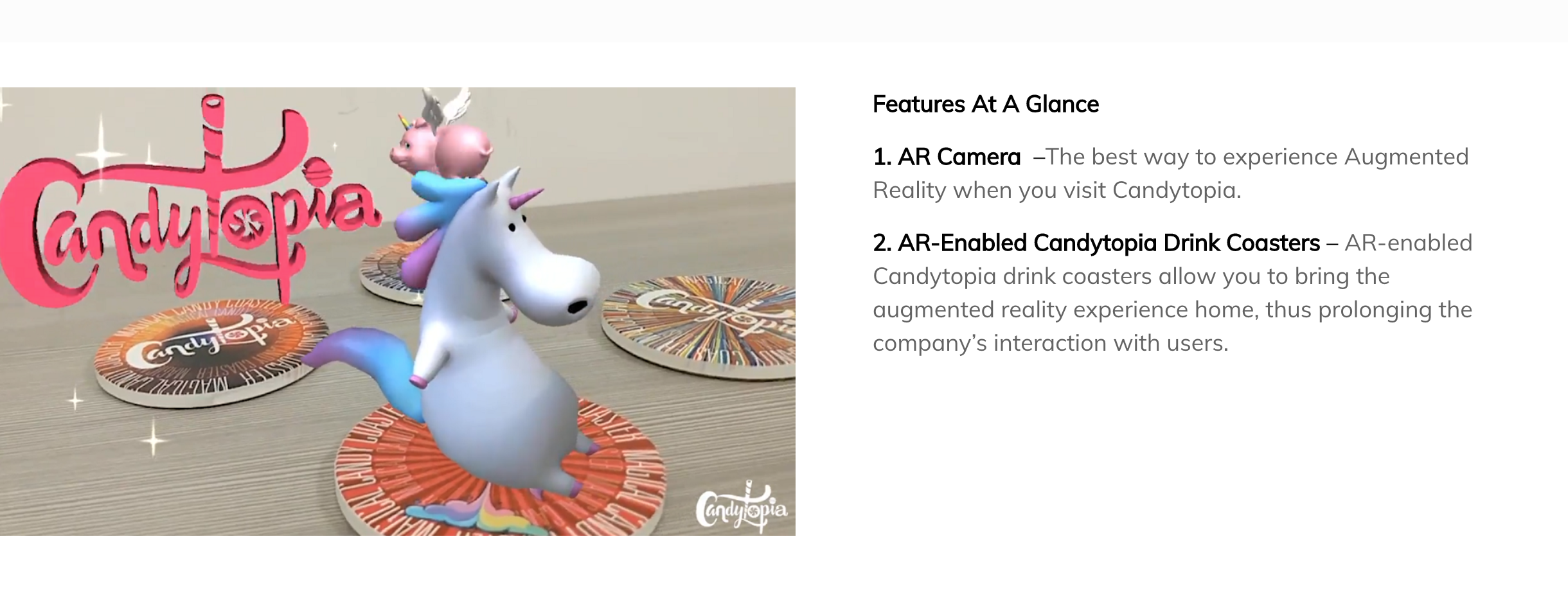
1. AR Camera – The best way to experience Augmented Reality when you visit Candytopia.
2. AR-Enabled Candytopia Drink Coasters – AR-enabled Candytopia drink coasters allows you to bring the augmented reality experience home, thus prolonging the company’s interaction with users.